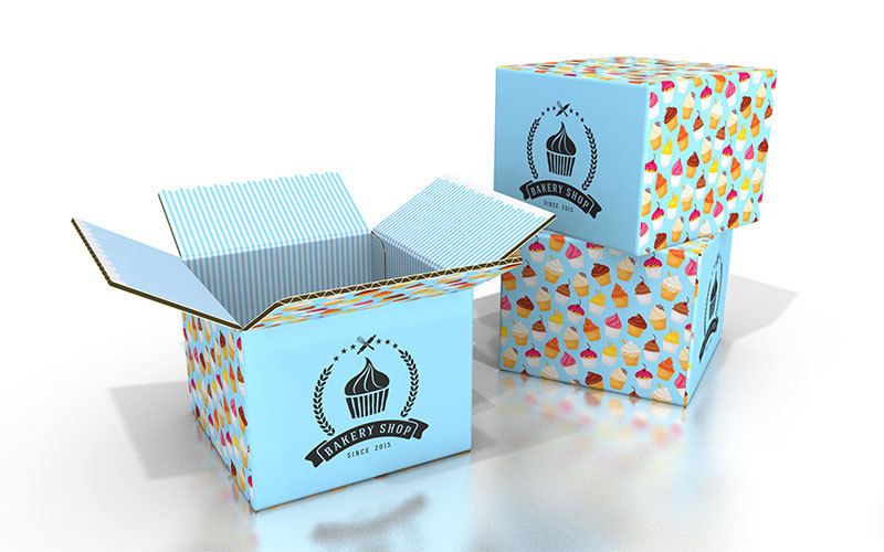
Your shipping boxes or mailers are a great place for your logo, but printing your logo on a cardboard box is a little different from printing it on paper—and a lot different from how it appears on a digital screen.
In order to have a successful end product, you need to know the requirements for a logo that will print well on boxes. This blog will talk about some things to be aware of when printing logos on corrugated cardboard so you can get a clear, beautiful logo on your boxes.
How to Create a Logo that's Perfect for Printing on Boxes
There is a pretty big difference between ink on cardboard and pixels on a screen. You may find that printing your logo on a box results in a dark, muddied version of your logo. The last thing you want is to design a customized box and end up with a run you don’t want to use.
If you are going to create an awesome brand-customized box for shipping out your products, then you need to know how to create a logo that will be successful on the material.
High Resolution
Unlike the web, printing requires a high resolution for clarity. While websites would be slowed down with large file sizes, printers will need to use high-resolution files (300ppi) to create the crystal clear image you are looking for. The higher the resolution, the more dots of ink are used per inch, creating a non-pixelated (or smoother) version of the image.
Transparent Background
A lot of logos use a colored background (like white or black) to create the right image for most platforms. When it comes to printing, the color of the box will make up the color of the background. If you submit an image with a white background, the printer will think you want a white box printed on the cardboard. With kraft (brown) boxes, this will look very awkward, and with white boxes, this could mean a waste of ink with a weird white ink-finish surrounding your logo.
You want to create a version of your logo with a transparent background for best results. Don’t forget to consider how the box color will impact the final version of your logo. You may need to change the colors of your logo slightly if they depend on a white background and you are printing on kraft cardboard, for example.
Cut the Clutter
If your logo is busy, a simplified version may be better for boxes. Too many details can get lost in the printing process. This is especially true if your logo contains text and a lot of color. Try creating a monochromatic, simplified logo version that can be used with logotype on your boxes.
Your logo might be perfect for your digital platforms, but sometimes brands will create multiple logos to be used in very specific ways. Ultimately, you want to create a logo that will stay consistent with your brand aesthetic but also work well for the medium of the cardboard box.
Consider the Color
Not only will ink tend to print differently than it looks on screen, but a kraft box also adds a whole other element to your design outcome. If you are going with white cardboard, you will get brighter colors—but with kraft, colors will be more muted.
Always consider the color variation that will occur when moving from screens to print. We offer a helpful color guide to give you a better idea of how this may play out for your design.
While designers usually use RGB color for their digital logo designs, you need your logo in CMYK color for printing. RGB (red, green, blue) has to do with the lights used by screens, while CYMK (cyan, magenta, yellow, black) represents the inks used in the printing process. This will likely create a visible difference in the color you see on screen versus on a printed product. Colors are often flatter and duller when printed compared to how they look on screen.
If you want to avoid this issue altogether, you can have a grayscale, solid black, and/or solid white version of your logo for different printing situations. You could use the white logo on a kraft box and the black or grayscale logo on the white box.
Think Inside the Box
Don’t feel trapped in your typical logo design. Some brands print a solid color on their boxes with a white logo for a more dramatic effect. Some print their logo in a repeating pattern on the inside of the box for further impact when it’s opened. You can really go wild with a creative design to set you apart!
Are you ready to get started? Our DIY box designer tool can help you make your own shipping or packaging products.
